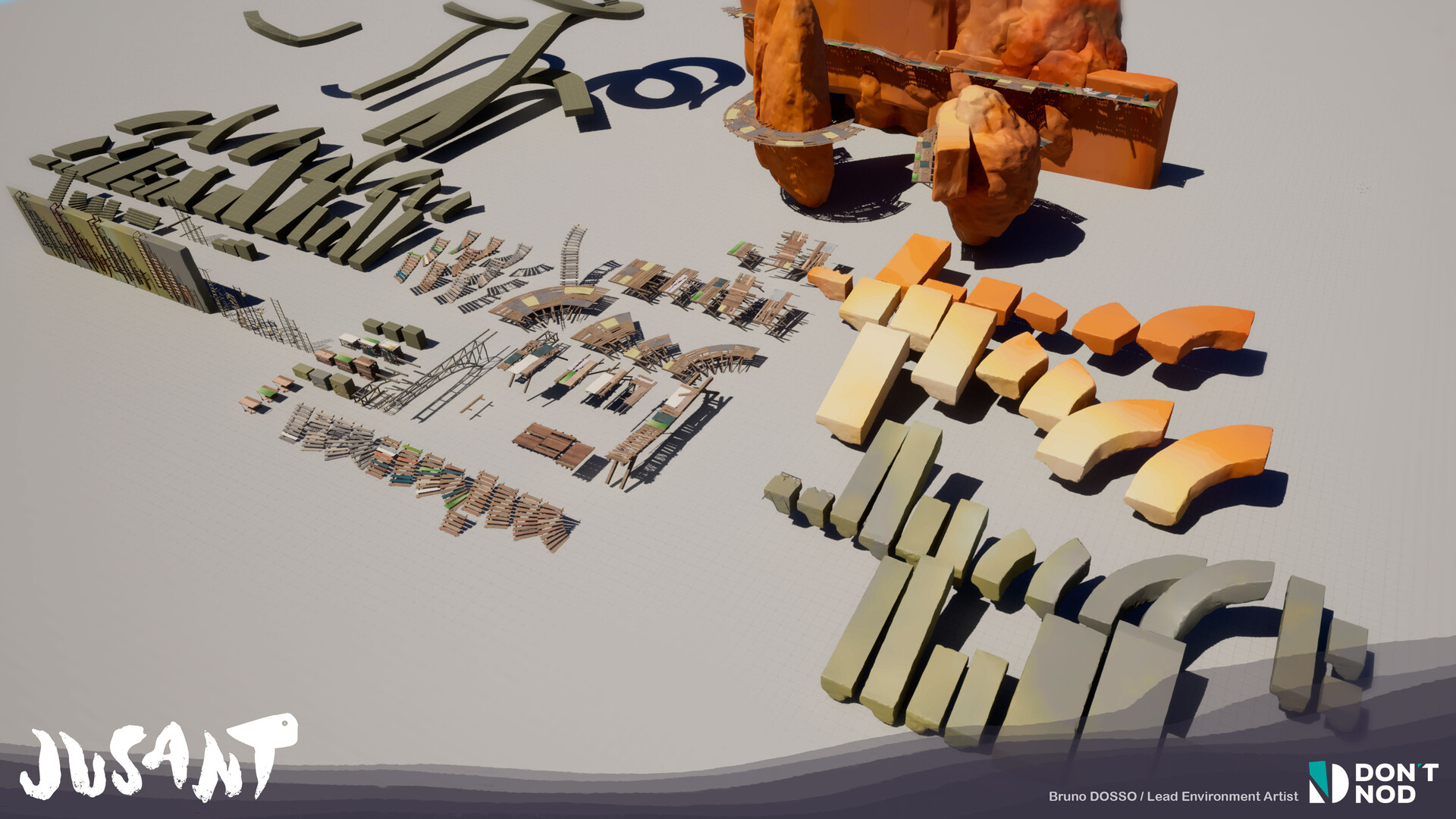
Scene setup for art direction
When I work on a project, I always create test-scenes to showcase everything in a tiny handy place. I line-up all the NPCs to check their relative height, compare their idle animation, see how they react when I move around them, etc.
It helps me check my work independantly. If the game isn't in a playable state right now because of some bug, I'm not stuck.
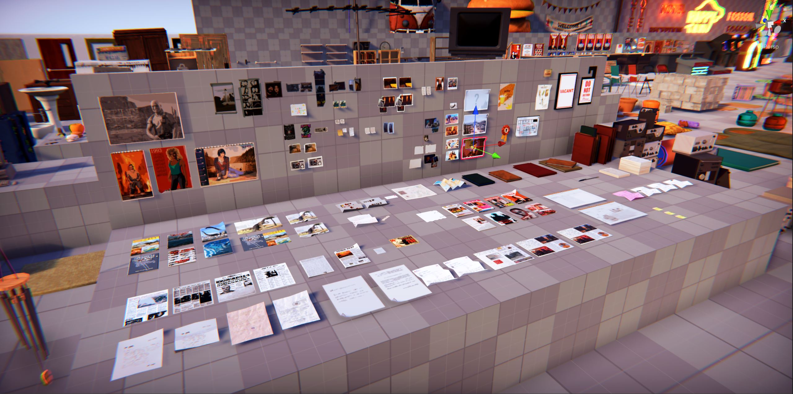
I typically create:
ShowcaseCharasfor a lineup of all charactersShowcasePropsfor an Ikea-style overview of all game propsShowcaseMatsfor a grid-view of all materials in different light conditionsShowcaseUIfor a scene where I can play with all UI element
Note the word "all". Exhaustive lists let you oversee the game content and build confidence. When you work on, say, the pickup UI, you can test it with all pickable items. When you ask yourself Is the color red used on a character?
, or when the team asks you a specific question like how many props use complex collisions instead of simple and why?
, you can answer confidently.
Other team members have their own test scenes. Game designers have a "gym" to test traversing mechanics and refer to their metrics. Same for enemies, if any. Sound designers have every combination of ground materials and room sizes, to test reverbs, jumps to water, etc. You get the idea.
Scenes you can test
Showcase scenes must be playable. On the video above, I didn't just put the T-pose NPCs on a line. These are the same Actors (aka prefabs) used by the game. So they behave exactly like in the game. They look at the player, their clothes animate with the wind, they have a UI feedback when I come close, and a dummy dialogue when I talk to them. I can check how the camera behaves around the tall robot characters, how they are seen when driving the van, and if the colored name in the bubble UI correlates to their appearence.
With this kind of modularity, you can quickly test some specific part of your game without having to go through long loading times and intricate action sequences. The time invested creating the scene will largely pay off.
Assets and systems must be modular enough to let you create playable situations. Put an NPC to talk to, interact with a dummy cube to to test collision, trigger autosave to check if the UI doesn't overlap anything, climb a ladder to test the anim & camera, play a cinematic to tweak DOF settings, roll the credits... Oh nice, this surprising juxtaposition gave you a cool new idea.
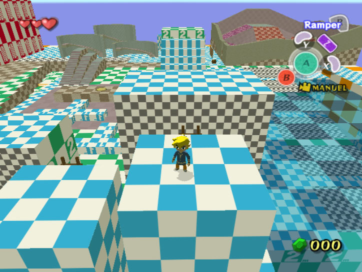
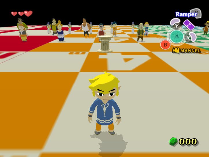
I'm a believer of testing your own game because testing helps understand your craft. Plus, your co-worker won't love you if you break the game often.
Test scenes don't discharge from testing the real game though. But if something's off on the test scene, you can be sure it's not correct on the game itself!
Your own playground
Look at your test scene as your cozy playground, something you setup to showcase your own work. It should feel nice. Create your personal exhibition. Showcasing the game to yourself is also a mandatory part of iterating on it. Create, test, draw conclusions, repeat.
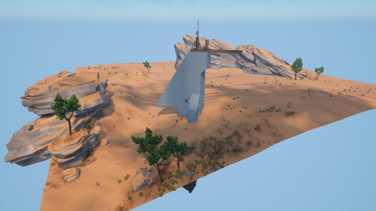
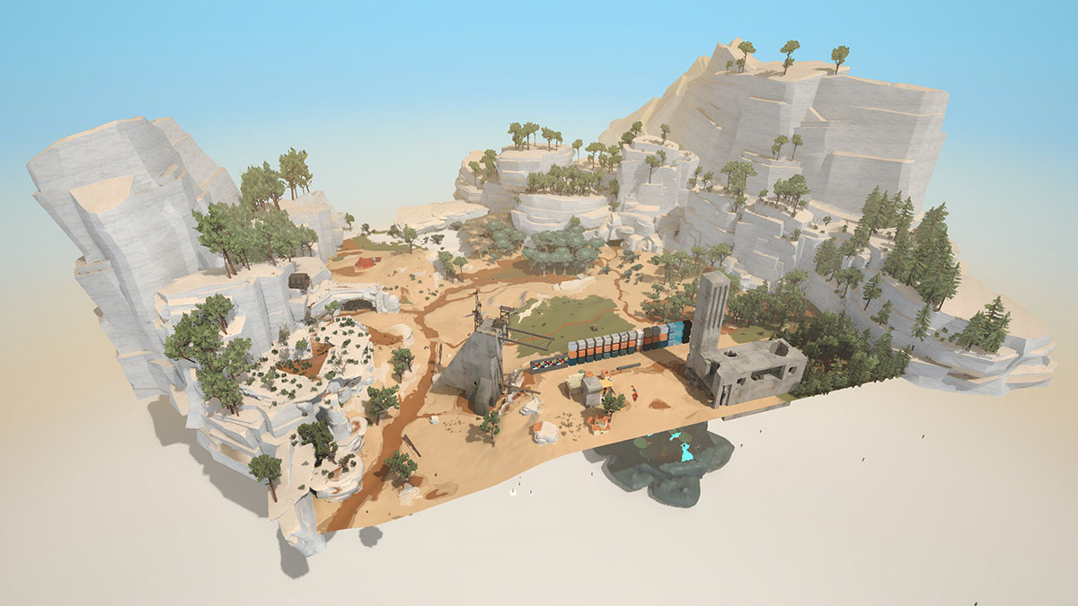
As an art director, I'm pushing for a specific style. I don't focus on a single prop or character. I'm constantly looking for the big picture, the artistic unity. So how can I make my life easier for this goal?
Maybe I need a playground scene to test props arrangements? A mini-world with all the game biomes, shrunk to the minimum surface so I can quickly iterate over it, trying associations, drawing conclusions and making changes.
I aslo want to see an exhaustive, organised arrangement of all the props to check their palette, silhouette and level of details. A nice warehouse would be neat, with all the game props, nicely grouped by category, arranged on a grid, so I can compare them and chose witch one to improve. What parts of the game need more consistency? How can I play with this kit to create something unique?
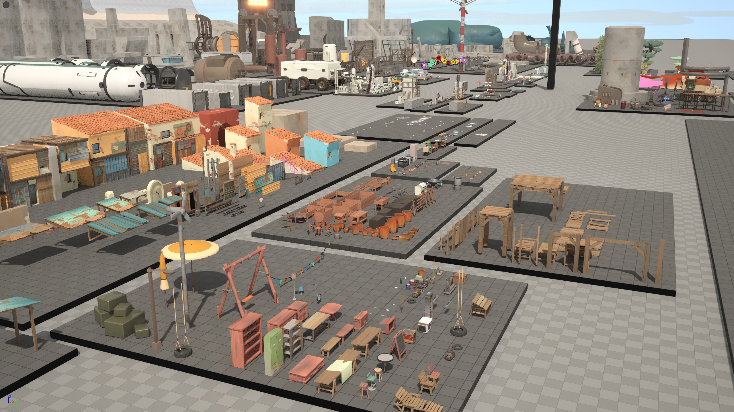
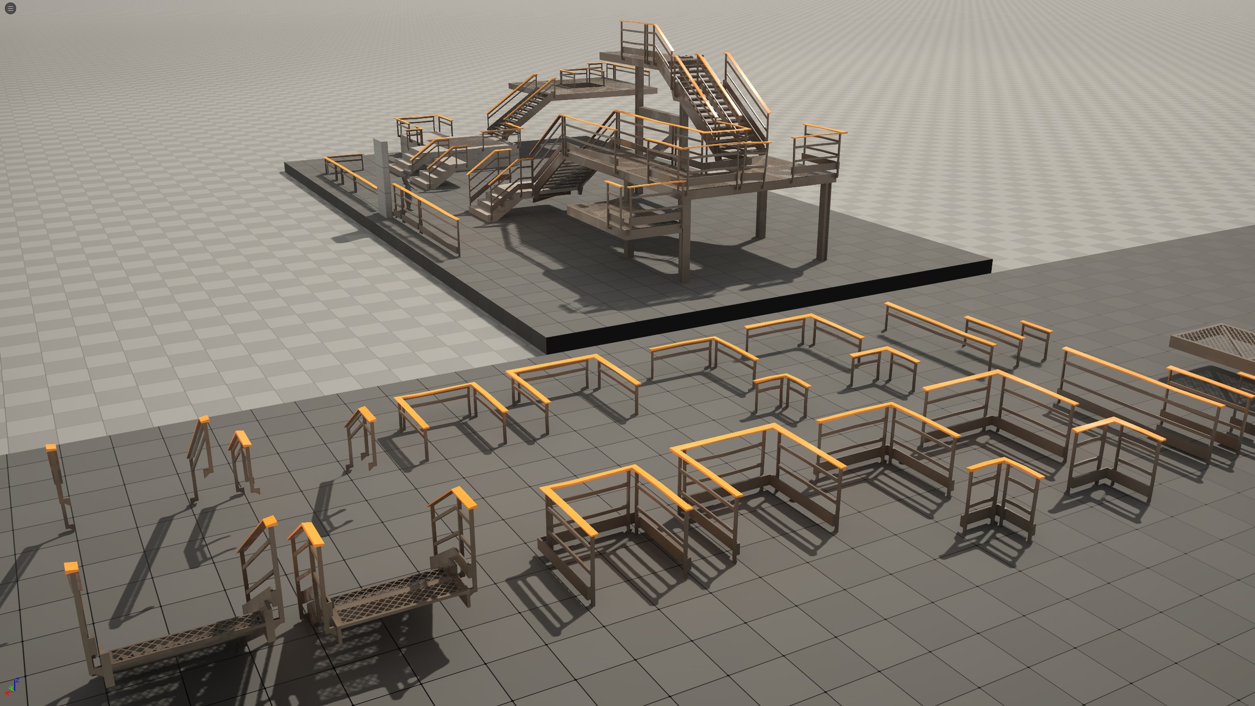
Small teams want the best value from what they can deliver, and showcase scenes also help in that regard. I can control the scope of the game by looking regularly at the catalogue of props, recognizing the ones that are not used anymore, or that I feel are very similar to eachother, and flagging them as deprecated. Then I go and replace the pink props in the game by similar props. Less props to polish equals more time to polish the remaining ones.
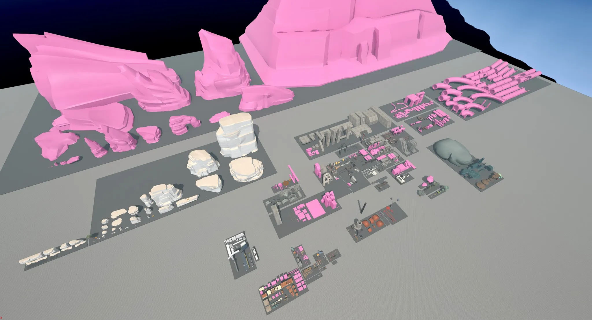
Everything can have its showcase
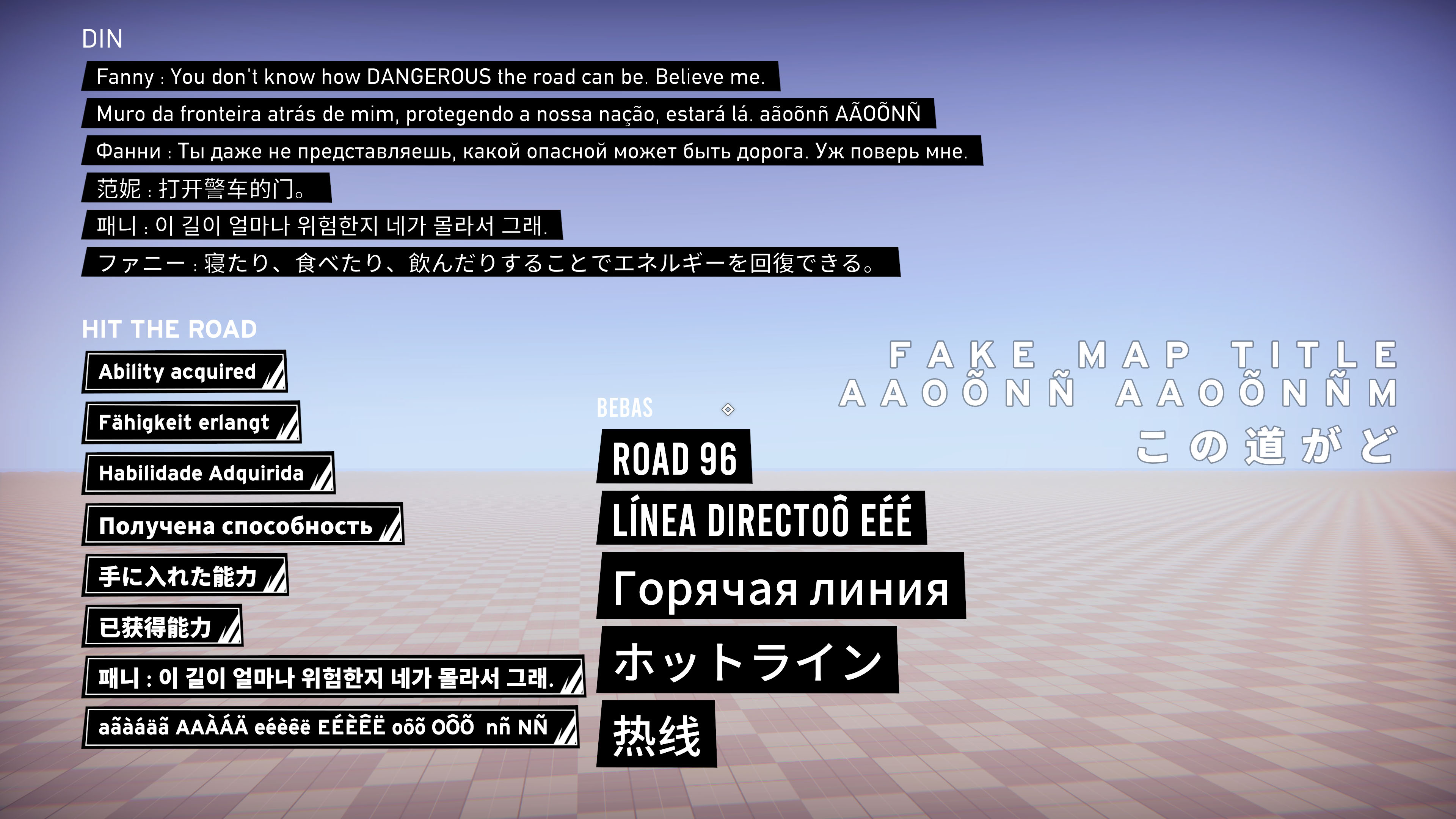
This method can be applied to other projects than games. I wrote the CSS for this website, so it'd be handy to display all my elements in one place, right? Look at them as a whole, try nesting them, being able to iterate over them without having to check 10 places at once... I think you got the idea now. Here's the CSS Showcase of this website.
Conclusion
Take the time to create and maintain showcase scenes so you can iterate confidently on your project. Don't neglect the real game, on the contrary, try to summarize the game in simple condensed situations where you can see the big picture, iterate fast, and so that your work benefits the entirety of the project.
Updates 🎗️
-
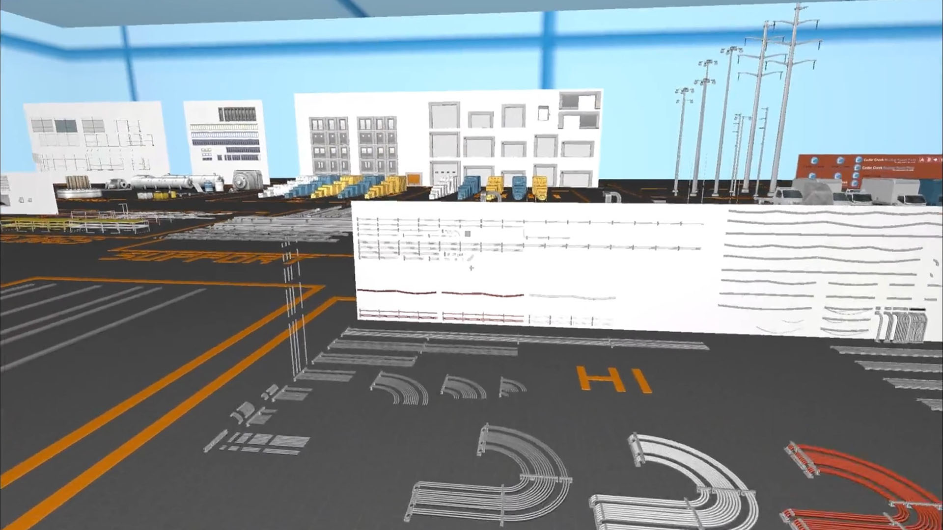
Robin-Yann Storm wrote an article 2 years ago about Showcase scenes for props. He calls them Zoos. He uses them to find props without dabbling in project nomenclature, with precious examples from Counter Strike and Overwatch, check it out!
-
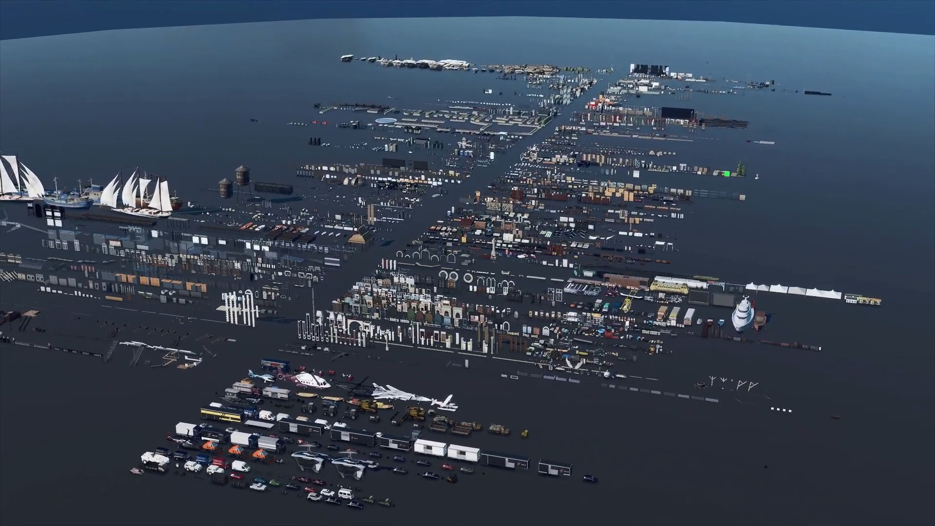
Morten Olsen talks about the importance of props in Hitman. They progressively gathered props during the whole trilogy (12000!) in a huge "Prop Library".
-
Bruno Dosso shows before/after shots of Jusant levels. They used "Hotwheels kit" to blockout the ground path with modules. The artists could then replace it with similar-size polished props, without changing the level design.
