CSS Showcase of this website
This is a page to show all the style elements available. You're currently reading a <p> element. The title above is a <H1> element. Don't forget to check the responsive behaviour! In fact, this is the sole purpose of the current article: to test the building blocks of this website. Have fun looking at my handmade html/css/js corner of the internet :)
This website uses semantic html. It means that the reader view of any browser or RSS client will extract the content and display it correctly. CSS is only for presentation, not content.
Normal text Bold text <b> monospace <code> link <a> .button .role .tag [11:25] .timestamp
Big heading <H2>
<H2> is used when the heading must be as loud as the surrounding pictures. It is mainly used on project pages, where the main content is group of pictures. It is almost as big as <H1> and has big margins, so on text articles, I prefer to use <H3> to better differentiate from the page title, and avoid jaring splits.
Heading <H3>
The main heading used on articles. It doesn't split the flow of text as much as <H2>, and can be long while remaining easy to read.
Tiny heading <H4>
Used as a sub-heading, <H4> has the same font-size as a paragraph. It's very similar to any bold text <b>. It is used to title a negligible section. I don't use <H5> nor <H6>.
- this is an unordered list
- made of <li> items
- <li> is a block, it can be used like a paragraph. A list item can be long, it will wrap at the end of a line. So it is possible to use it as a bullet list of paragraphs with variying sizes.
- a list that can be nested by one level
- or more, the number of levels is infinite
- but beware of complexity
- and if you already read the quote below, remember that when something is possible, we humans go for it. So please keep your notes simple and don't use more than 1 nested level.
This is another simple paragraph, to look at the margins between a list and a paragraph. Most of the content in an article is written inside paragraphs, so this block of text is relevant. Yes, it is!
- Are you still reading this?
- Can anybody hear me?
- Am I stuck in a neatly ordered list?
This is a <blockquote>, mainly used to cite cool people who said cool stuff. For example this one sentence by Edward Tufte: Confusion and clutter are failures of design, not attributes of information.Source with link
A .card class can highlight any block, like this paragraph. The article: id Software Principles is a good example of how it is used.
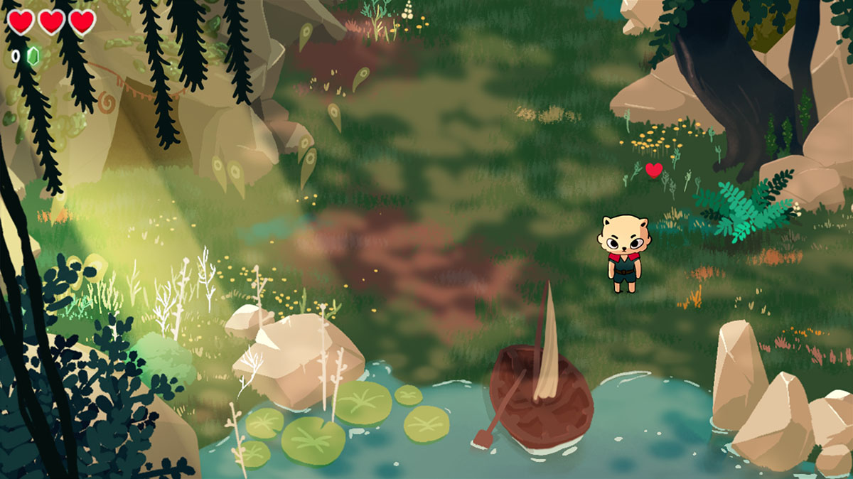
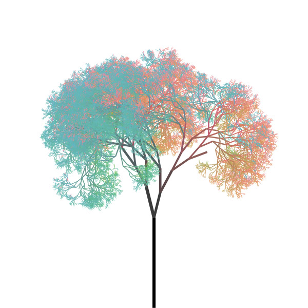
Ok so now let's look at pretty pictures. You've come to this website with this goal in mind, haven't you? Next is a <figure> element with an <img> inside.
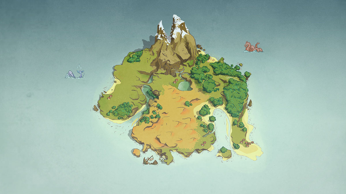
A <figure> can also contain a <video> or a <canvas>, have multiple children, and end with an optional <figcaption>.

Each element in a figure will take 100% of the width.
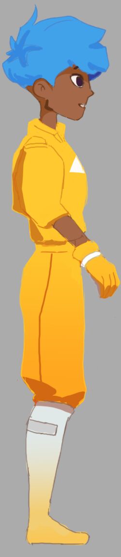
The layout can be different. Each row can be composed of up to 4 elements. The layout only applies on wide enough screens. Layout can be preserved on narrow screens with the class .forceLayout.
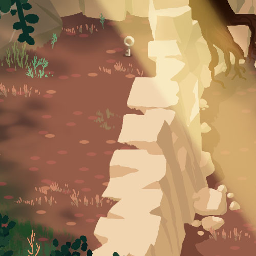
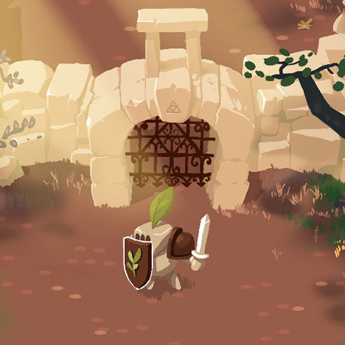
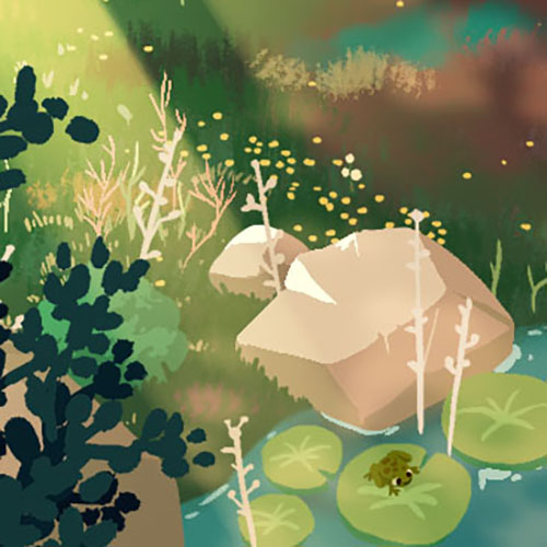
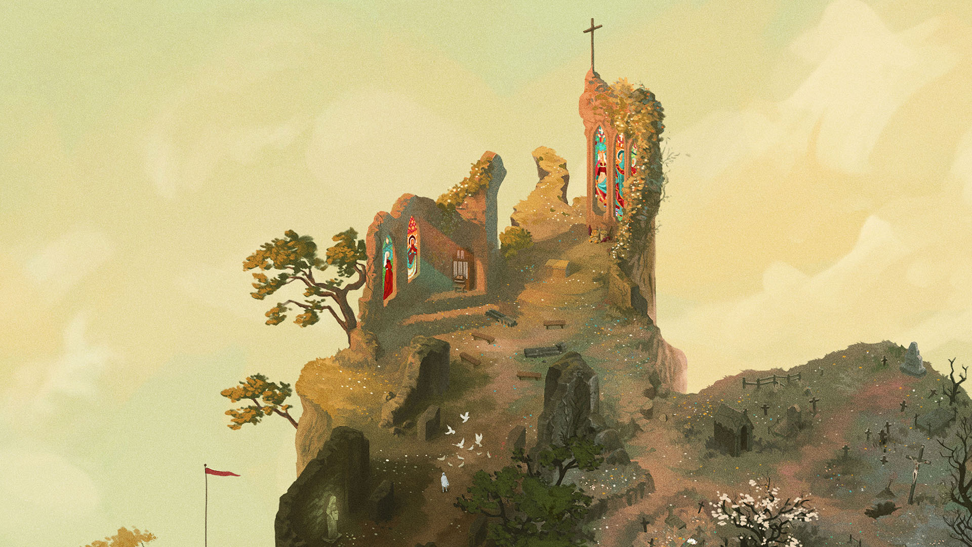
By default, a figure takes the same width as the text elements. To put emphasis on visuals, there are 2 options to have wider figures: overflow and big.
Obviously, you need to look at the page with a wide screen to benefit from these options. On a phone held vertically, everything will look similar. On a tablet, overflow and big will appear similar. The purpose of big is to make use of all available space on PC screens.
To stay structured, a page should not mix different widths too much. Use overflow with visuals lacking a clear frame, or if there's no text around.
On wide screens, an element can be "extended" without being scaled, by using the responsive-ratio class. The default background-color is white, but you can choose any color.
Elements can thus be more responsive. Look at the first video of this page for an example of a square video adapting to tall phones and wide PC screens.
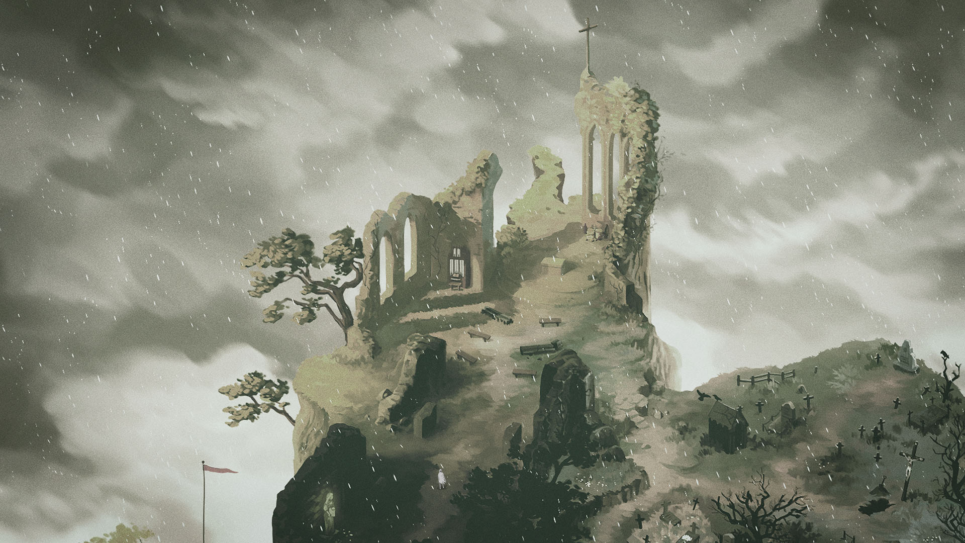
The layout options can be combined with the width options. Here is an example of a big grid of two pictures.


By default, elements can be zoomed by clicking on them. Zoom is disabled when it wouldn't result in a bigger display. So no zoom on narrow screens, nor on single big elements, because they take the whole page width. Try zooming on the figures above!
The zoom feature can be disabled on each element with the noZoom class. Use it rarely, only for elements that wouldn't benefit from it.

The above element is also set to a specific width by setting the css property directly: style="max-width: 10em".
By default, tall imgs and videos are scaled down if they don't fit the window vertically, to prevent them being out of frame. To counter this, use the noFit class on an element (If you don't see a difference between the 2 pictures above, try resizing your window to a wider ratio).
.noFitIf you thought the previous css class was weird, look at this one: overlay reveals another picture on hover.
Is it useful, you ask? Hardly. It's a gimmick I may improve it later, because for now, it only works with a mouse, and not with a touch screen (and any input lacking a hover state).
-
More on lists
Haven't we look at lists already? Yes.
But list items can also be containers to other blocks. And I didn't show it before. So it's possible to have multiple paragraphs, and even figures inside a numbered
licontainer.
and even figcaptions This way, an article can be structured more strongly. For a use case, have a look at Playing with code, an article using an ordered list to present a sequence of steps.
-
By the way, this is an H4 heading
All the content inside a list item is indented. Compare this paragraph with the next one.
We're back to the root of the article. You'll notice that I didn't use a single lorem ipsum since the begining of this article. And I am quite proud of it. But if you want some, I can nourish your appetite! Can you read lorem ipsum? I can't. So maybe I won't unleash the dark powers of the lorem... yet.
What was this? A subtle and thin line gracefully separating content? Is that a hr element? Yes it is!
And what was this? A breath of fresh air, empty as a clear sky, creating space at will, to ease our eyes? Simply put, a div.space.
And that's it! End of the CSS showcase. These are all the common blocks, but the website is filled with custom stuff. I like playing with css and js, so I often set custom styles for elements. If I ever need to use it more than once, I then extract the logic, and put it here.
Are you curious to look at some of the custom elements I made?
- a 3d-model web viewer! I plan to use it everywhere. Soon.
- a video playlist widget! with titles to group videos inside a long playlist.
- this interactive toy to play with particles. pure custom js and css!
- the css animations I did to present a game I worked on. Kinda hard to animate with css, to be frank. But it's the only way to create responsive animations. I'd like to explore this eventually.