Roles: Art Direction Environment Art Tech Art
I crafted several dioramas to challenge myself at modeling, texturing, lighting and shadering. I produced 3 scenes, rendered in Unity HDRP, & recorded the whole process live (VODs available).
I learned a lot in 3D: using trimsheets, making good-looking & optimized vegetation, creating customisable shaders, setting up cameras & tools to record 4K screenshots or videos, creating "threads" on twitter to attract attention (>10k likes!) & perfecting the pipeline between my different tools (blender, photoshop, unity).
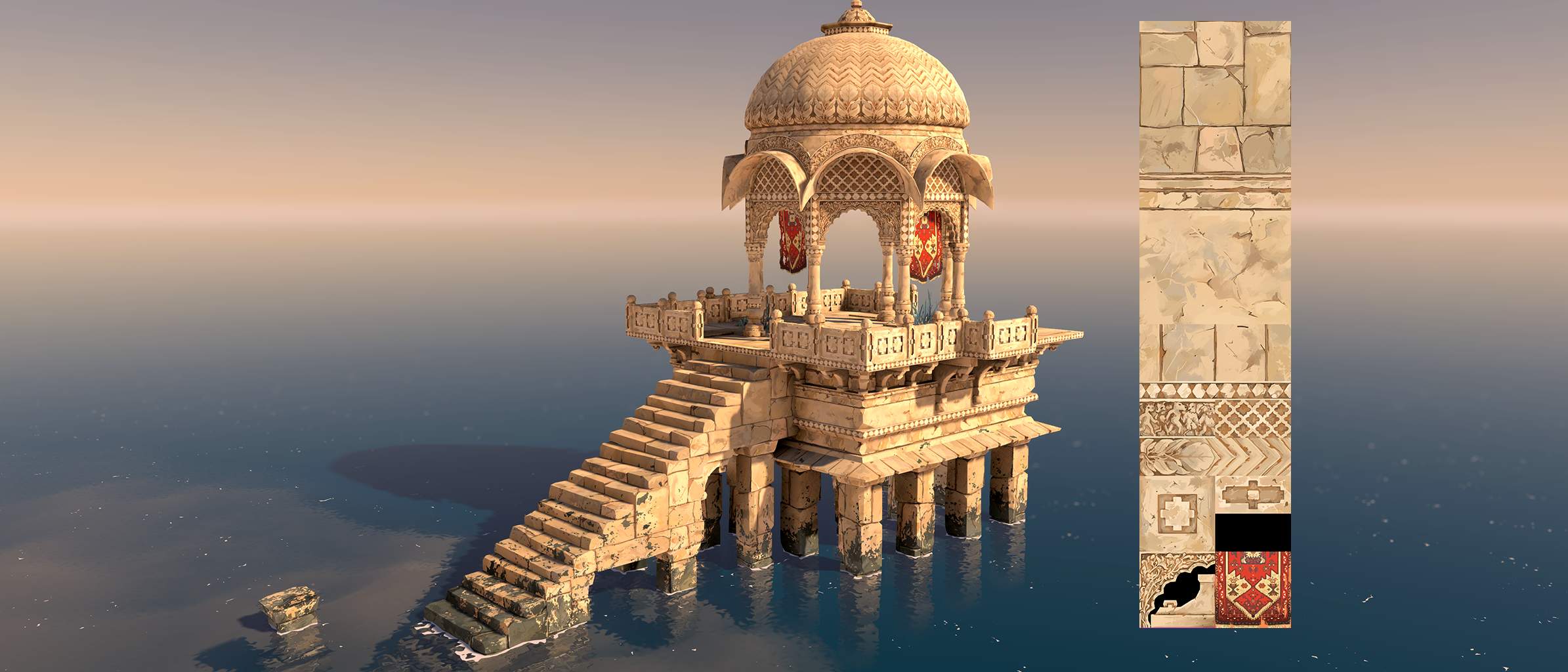
The Indian Temple
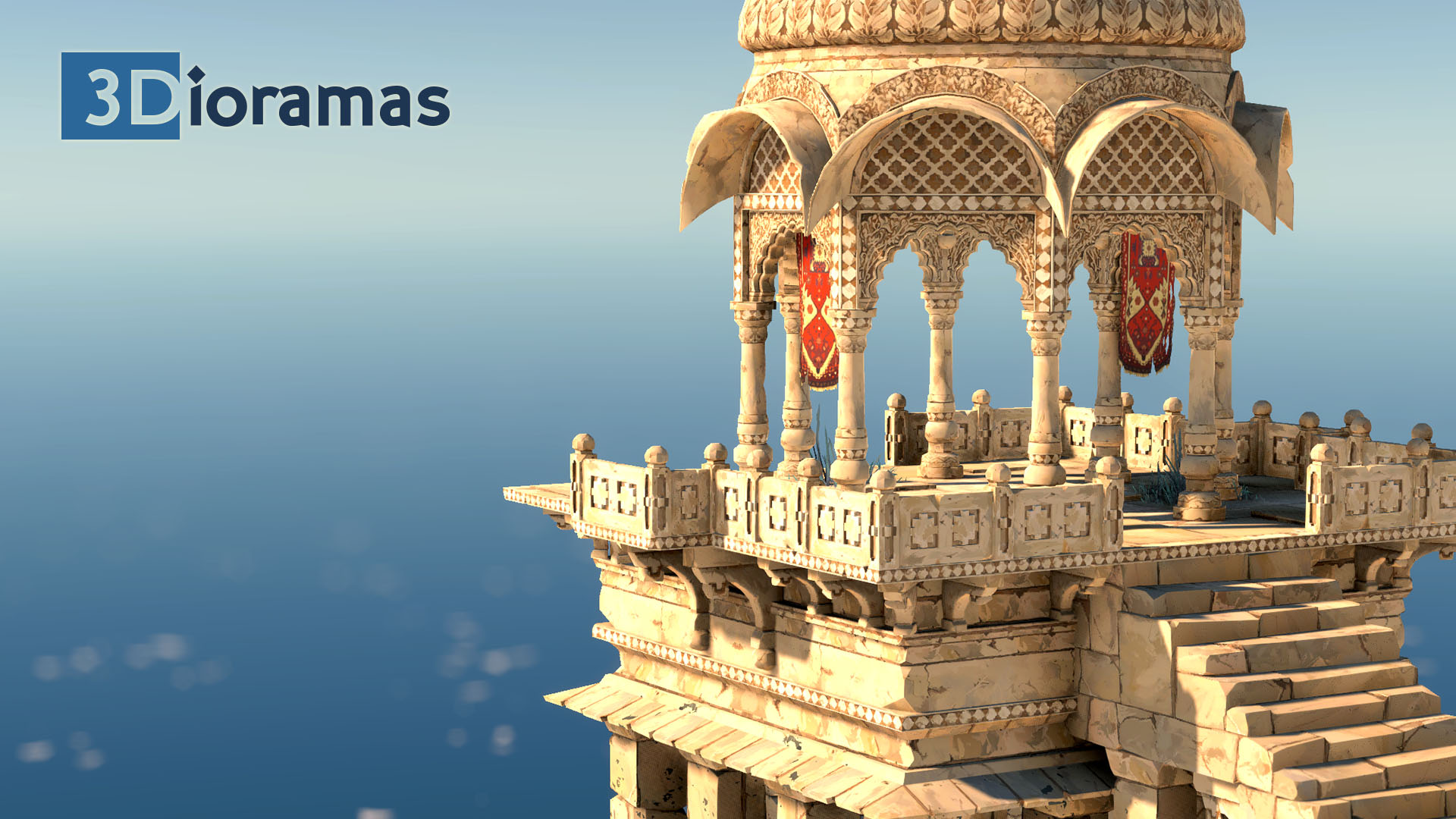
I made this scene in 3 weeks. As a reference, I used pictures of a real temple in the fortifed city of Jaisalmer.
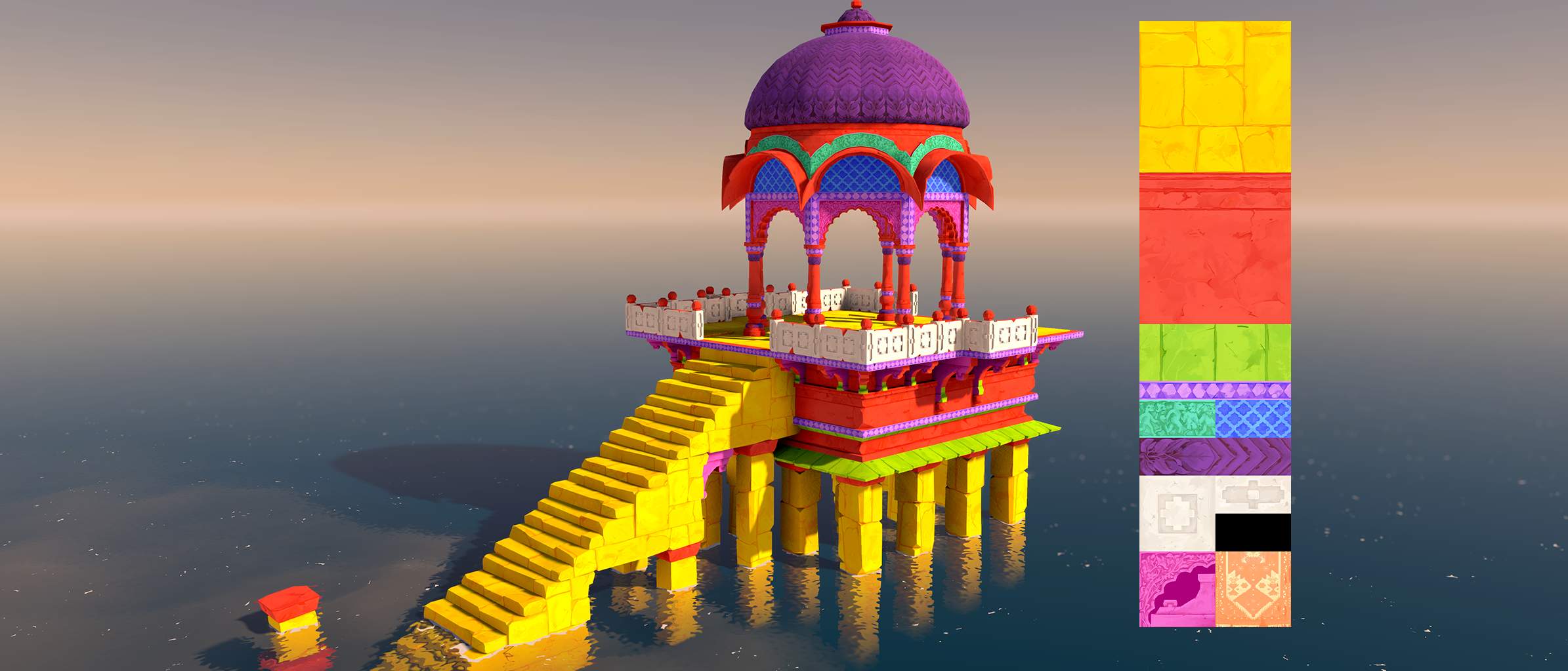
I focused on style and optimization. There's only 1 Texture. I didn't use normal maps, AO maps, just the diffuse map, carefully handpainted. The lighting is also very simple, with just 1 directional light. The Post Processes make everything look nice. This reduces the number of drawcalls drastically & lets me iterate quickly on the texture.
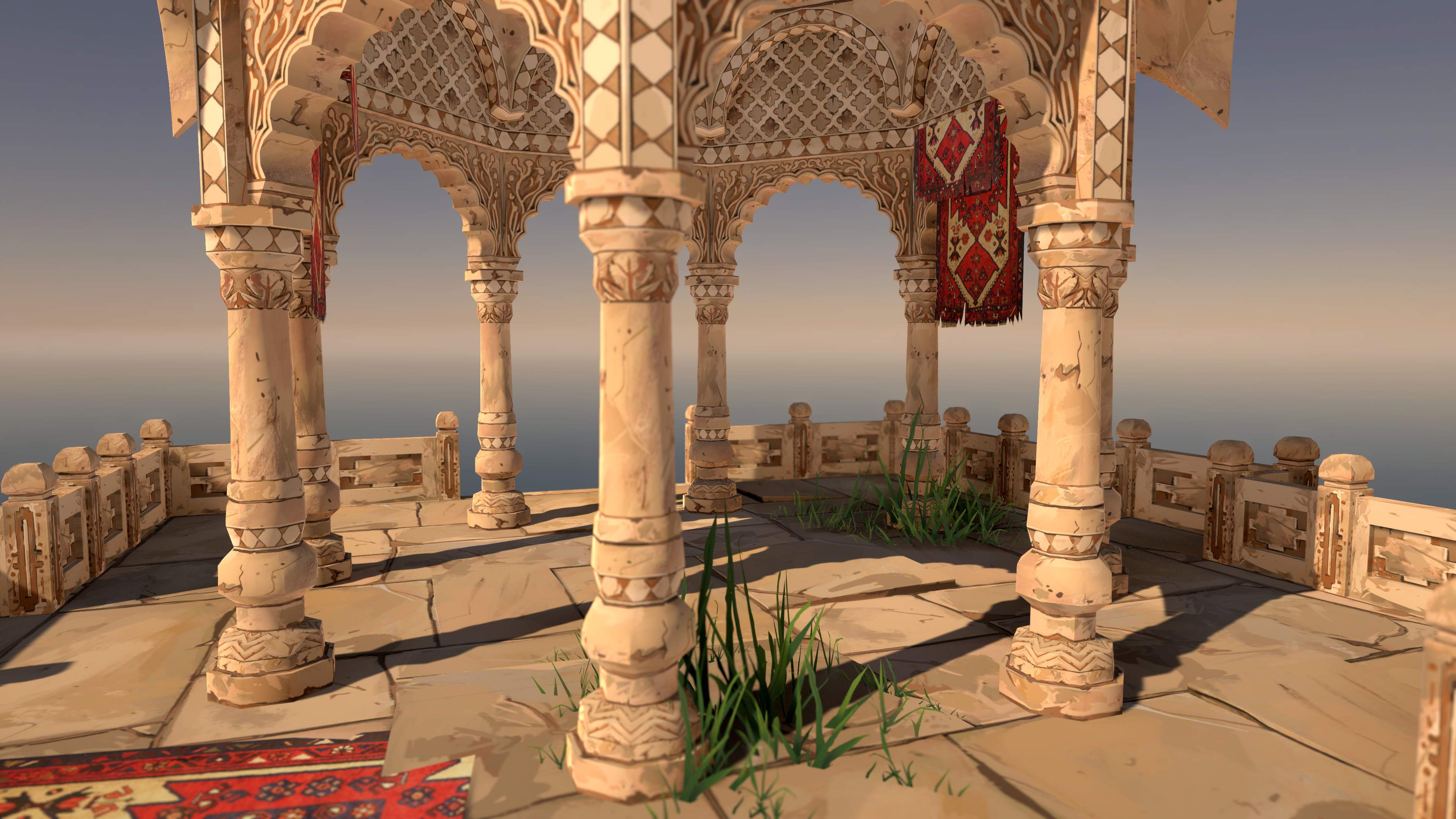
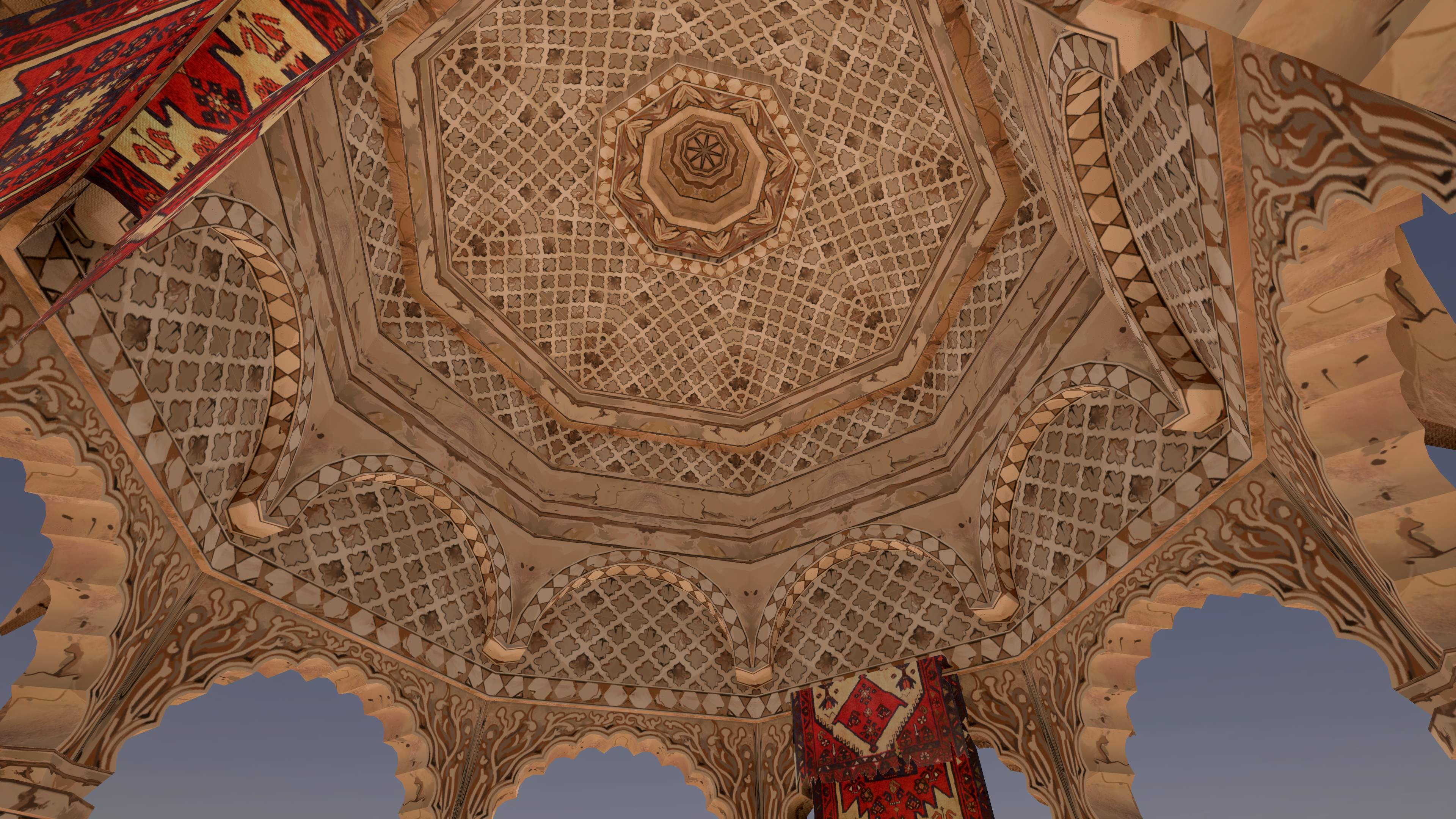
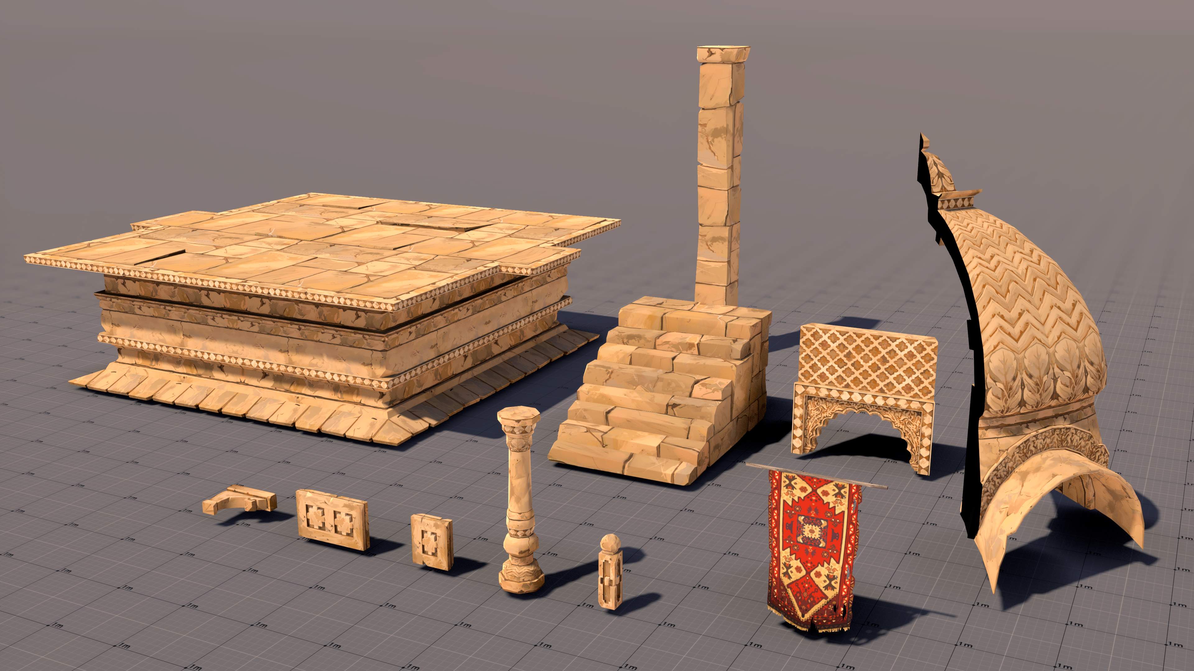
I used trimsheets. I learned a lot on UV mapping, texture mipmaps & how to create synergies between the texture & the geometry. The setup is long & difficult, but when it's done, it's very scalable. It becomes very cheap to create new props. I stopped at 11 props, used only for 1 temple. But I'd like to create other temples & more props.
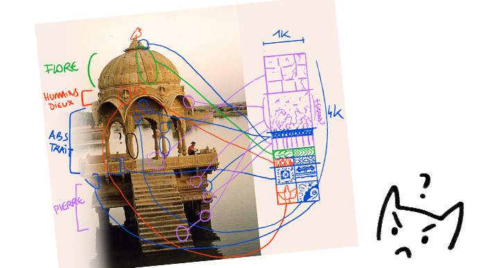
Creating only 1 texture for the whole scene is probably overkill though. The scene could have 4 different materials for the stone parts instead of only one. I ran into problems when I wanted to unwrap UVs vertically.
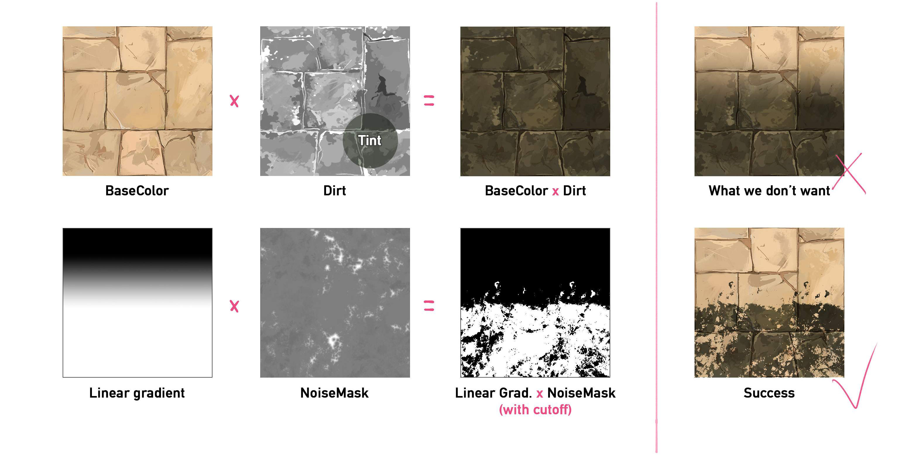
I created custom shaders to break the visual repetition of the tiled texture. Some seaweed appears on the stone when it's near or below water (practically: if it's below a certain height). I created the shader in shader graph, exposing useful sliders, while retaining the specific style I wanted.
The Boulder
I reduced the initial scope of a forest diorama to stay in the ~2 weeks time frame. The result is a boulder in a forest. The first try was too ambitious for my rookie skills on vegetation. I wanted to create a Ghibli-style dense forest surrounding a family of deers. After 2 days, I was still struggling with the first tree. Everything felt paper-made & I didn't have a clue how to make these bushes fluffier.
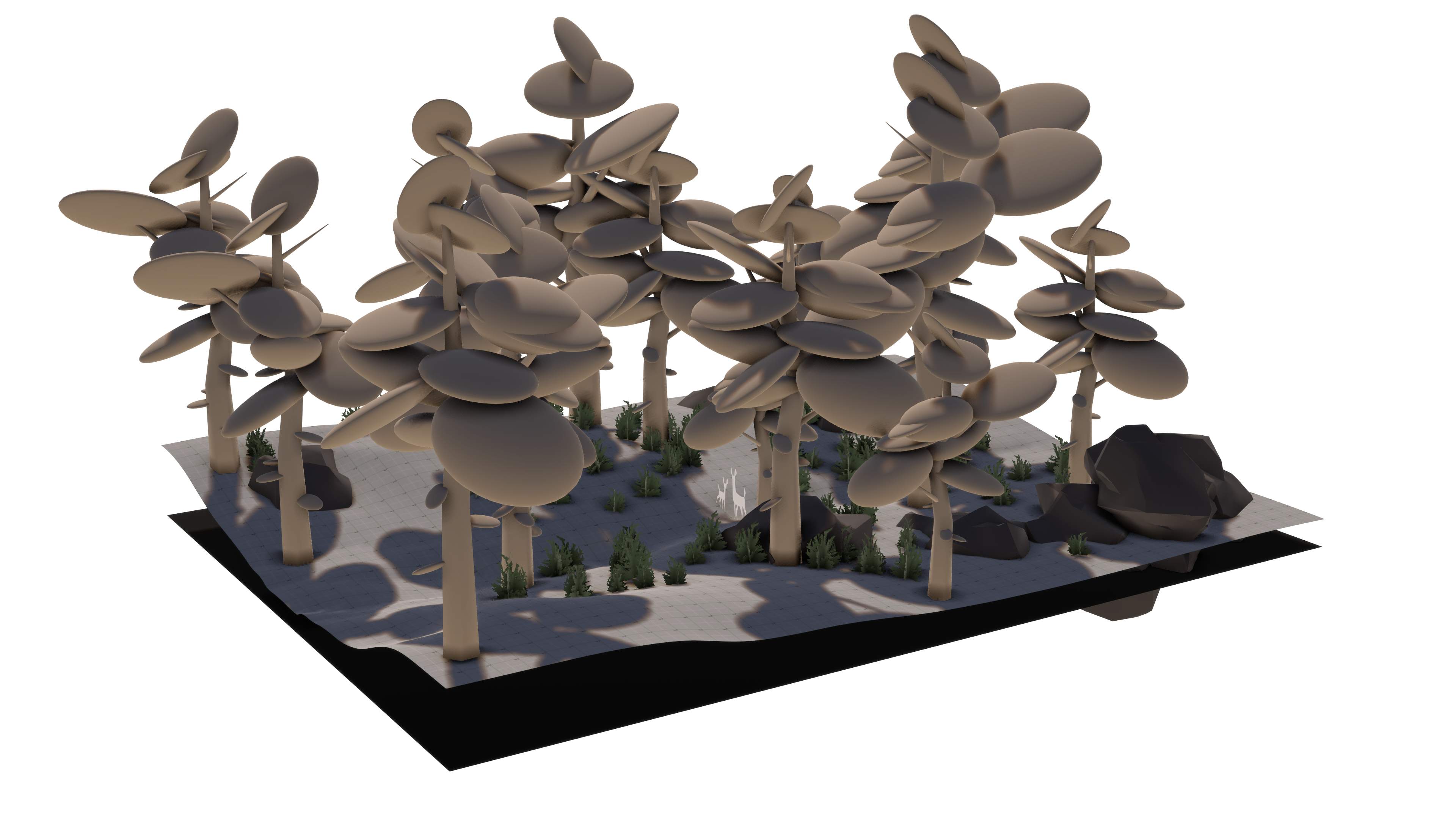
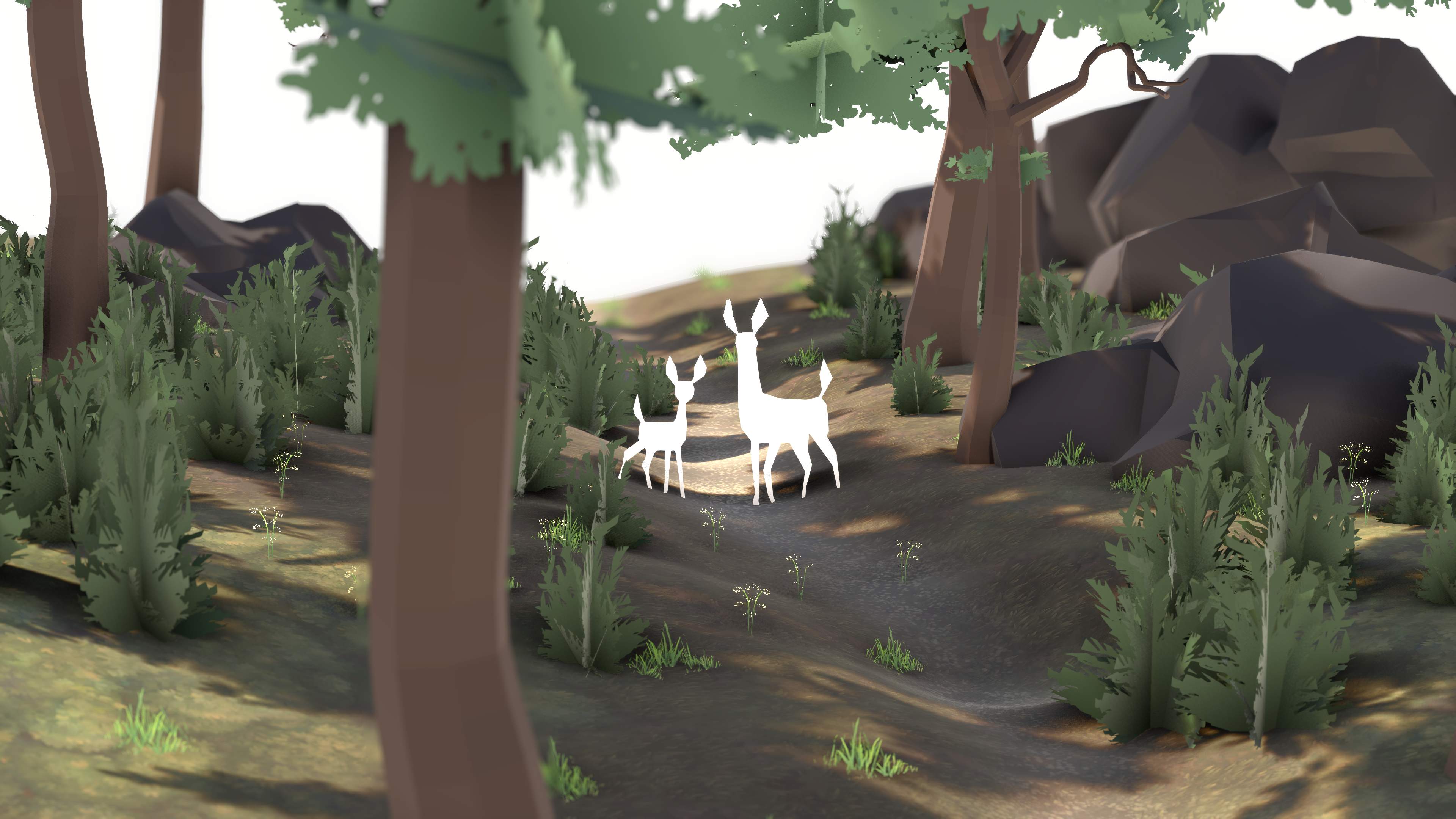
So I put the ghibli forest aside & chose a single, beautiful, precise reference: a peaceful drawing by Jimmy Malachier. I could concentrate on 3 rocks, a trunk & bushes. No full grown trees.
With retrospect, my first attempts failed because the leaves were too flat. I had better results at duplicating & assembling a small card module around a Sprig, & then transfering normals from simple shapes like cones or cylinders.
To break the flatness of the hand-painted terrain, I put grass patches around props. I created a custom shader for these grass patches to be the same color as the terrain.
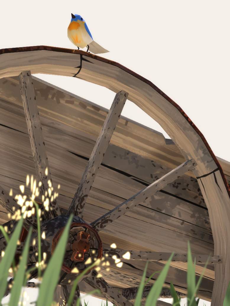
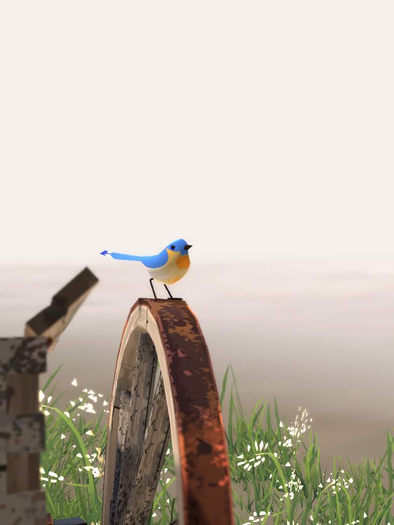
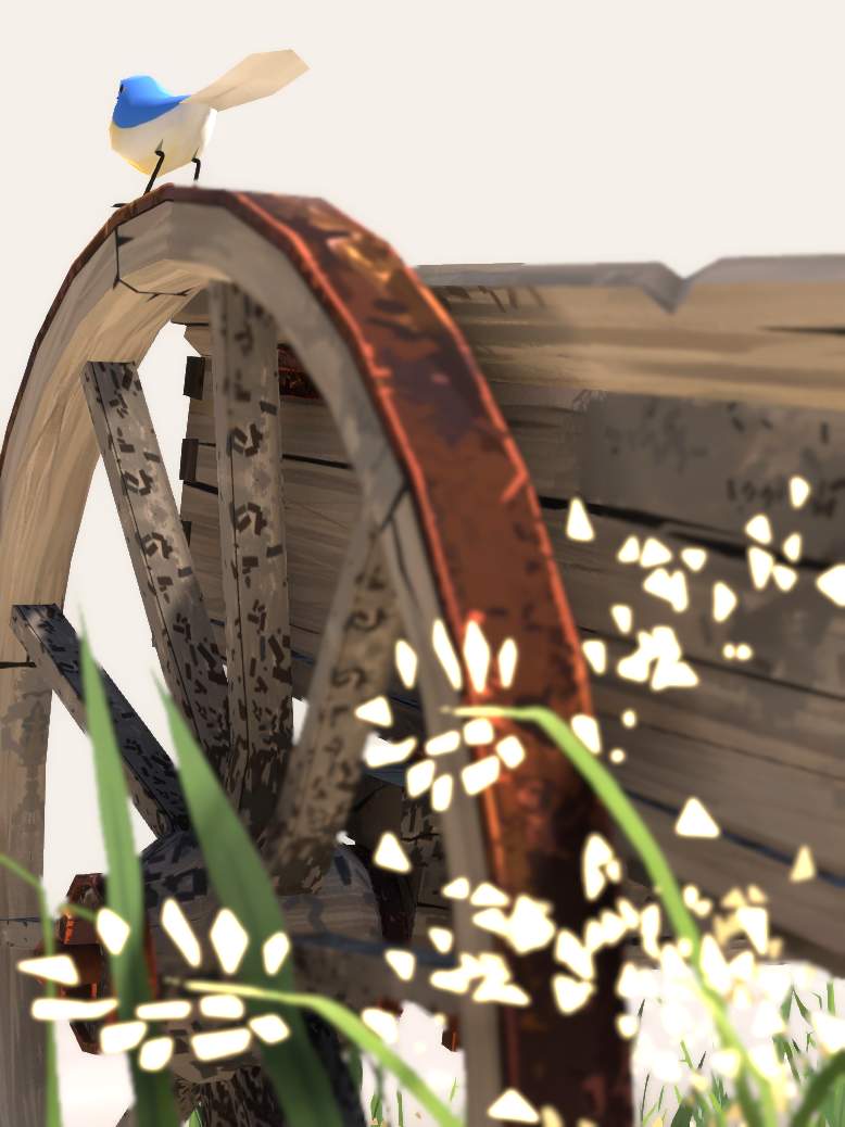
The Folorn Wood Cart
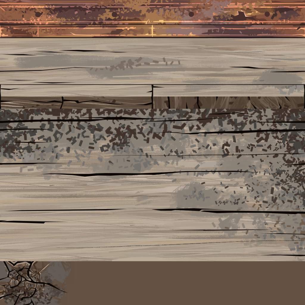
I started the dioramas series with this one. I wanted to get better at modeling & texturing with blender & Unity. I modeled directly in low-poly. I hand-painted a well thought trimsheet of wood planks & rusty metal parts, & patiently unwrapped UVs.
I could then iterate on the texture style. Finally I added details on the modeling, carves & extrusions where it fitted the underlined texture.
I tried to paint musty wood parts in the trimsheet, to place them in the cavities of the cart. The result is nice, but the trimsheet doesn't tile on every row, complicating the UV unwrap phase a lot. I should have made a shader, to "paint" the musty parts with vertex colors.
I added a bird afterward. With it, the scene gets a story, a subject, an elusive wonder. It's missing in the other dioramas. I'd like to add this kind of storytelling.
